View methods
plotdata
- RSK.plotdata(channels: str | Collection[str] = [], profile: int | None = None, direction: str = 'down', showcast: bool = False, schedules: str | Collection[str | Collection[str]] = 'all', showLegend: bool = False) Tuple[plt.Figure, List[plt.Axes]]
Plot a time series of logger data.
- Parameters:
channels¶ (str | Collection[str], optional) – longName of channel(s) to plot. Defaults to [] (plot all available channels).
profile¶ (int, optional) – profile number. Defaults to None (ignores profiles and plot as time series).
direction¶ (str, optional) – cast direction of either “up” or “down”. Defaults to “down”.
showcast¶ (bool, optional) – show cast direction when set as true. It is recommended to show the cast direction patch for time series data only. This argument will not work when pressure and sea pressure channels are not available. Defaults to False.
schedules¶ – schedule(s) to include.
"all"(default) includes all schedules for every channel. A single label (e.g.,"s.CTD") applies that schedule to every channel. A list matching the number of channels provides per-channel control, where each element is a label or list of labels. Usersk.schedulesto inspect available schedule labels.showLegend¶ (bool, optional) – toggle the figure legend on and off. Defaults to False.
- Returns:
Tuple[plt.Figure, List[plt.Axes]] – a two-element tuple containing the related figure and list of axes respectively.
This method plots the channels specified by
channelsas a time series. If a channel is not specified, then this method will plot them all. If the current RSK instance has profiles (e.g., viaRSK.computeprofiles()), then users may specify a single profile and direction to plot. In this case, however, this method can only plot one cast and direction at a time. If you want to compare many profiles, then use eitherRSK.plotprofiles()orRSK.mergeplots().Example:
>>> with RSK("example.rsk") as rsk:
...     rsk.readdata()
...     # Plot all channels from all schedules
...     fig, axes = rsk.plotdata()
...     # Plot specific channels from one schedule
...     fig, axes = rsk.plotdata(channels=["conductivity", "temperature"], schedules="s.CTD")
...     # Mix-and-match: conductivity from s.CTD, temperature from s.CTD + s.ODO
...     fig, axes = rsk.plotdata(
...         channels=["conductivity", "temperature"],
...         schedules=["s.CTD", ["s.CTD", "s.ODO"]],
...     )
This method has an option to overlay cast detection events on top of the pressure time series:
>>> fig, axes = rsk.plotdata(channels="pressure", showcast=True)
... plt.show()
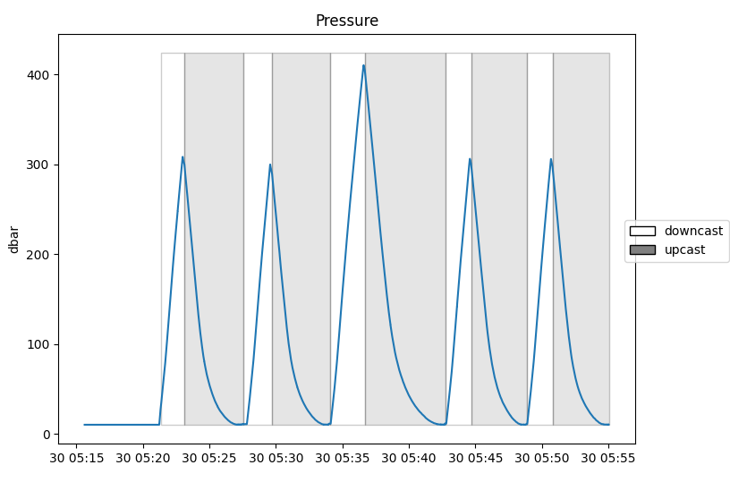
The figure above is the output of
RSK.plotdata()whenshowcastoption is on with the pressure channel.
plotprofiles
- RSK.plotprofiles(channels: str | Collection[str] = [], profiles: int | Collection[int] = [], direction: str = 'both', reference: str = 'sea_pressure', referenceThreshold: float | None = None, schedules: str | Collection[str | Collection[str]] = 'all', showLegend: bool = False) Tuple[plt.Figure, List[plt.Axes]]
Plot summaries of logger data as profiles.
- Parameters:
channels¶ (str | Collection[str], optional) – longName of channel(s) to plot. Defaults to [] (plot all available channels).
profiles¶ (Union[int, Collection[int]], optional) – profile sequence(s). Defaults to [] (all profiles).
direction¶ (str, optional) – cast direction: “up”, “down”, or “both”. When choosing “both”, downcasts are plotted with solid lines and upcasts are plotted with dashed lines. Defaults to “both”.
reference¶ (str, optional) – Channel plotted on the y axis for each subplot. Options are “sea_pressure”, “depth”, or “pressure”. Defaults to “sea_pressure”.
referenceThreshold¶ (float, optional) – if given, only points where the reference channel exceeds this value are plotted. Useful for excluding surface noise. Defaults to None (no filtering).
schedules¶ – schedule(s) to include.
"all"(default) includes all schedules for every channel. A single label (e.g.,"s.CTD") applies that schedule to every channel. A list matching the number of channels provides per-channel control, where each element is a label or list of labels. Usersk.schedulesto inspect available schedule labels.showLegend¶ (bool, optional) – toggle the per-subplot legend on and off. Defaults to False.
- Returns:
Tuple[plt.Figure, List[plt.Axes]] – a two-element tuple containing the related figure and list of axes respectively.
Generates a subplot for each
channelsversus selected reference. If nochannelsare specified, it will plot them all as individual subplots.When
directionis set to ‘both’, downcasts are plotted with solid lines and upcasts are plotted with dashed lines.Example:
>>> with RSK("example.rsk") as rsk:
...    rsk.readdata()
...    rsk.deriveseapressure()
...    rsk.derivesalinity()
...    # Plot profiles for specific channels
...    fig, axes = rsk.plotprofiles(
...        channels=["conductivity", "temperature", "salinity"],
...        profiles=range(0, 3),
...        direction="down",
...    )
...    # Plot from a specific schedule only
...    fig, axes = rsk.plotprofiles(
...        channels=["conductivity", "temperature"],
...        schedules="s.CTD",
...    )
...    # Mix-and-match: conductivity from s.CTD, temperature from s.CTD + s.ODO
...    fig, axes = rsk.plotprofiles(
...        channels=["conductivity", "temperature"],
...        schedules=["s.CTD", ["s.CTD", "s.ODO"]],
...    )
images
- RSK.images(channels: str | Collection[str] = [], profiles: int | Collection[int] = [], direction: str = 'down', reference: str = 'sea_pressure', showgap: bool = False, threshold: float | None = None, image: Image | None = None, schedule: str = 'default') Tuple[plt.Figure, List[plt.Axes]]
Plot profiles in a 2D plot.
- Parameters:
channels¶ (Union[str, Collection[str]], optional) – longName of channel(s) to plot, can be multiple in a cell. Defaults to [] (all available channels).
profiles¶ (Union[int, Collection[int]], optional) – profile sequence(s). Defaults to [] (all profiles).
direction¶ (str, optional) – cast direction of either “up” or “down”. Defaults to “down”.
reference¶ (str, optional) – Channel that will be plotted as y. Can be any channel. Defaults to “sea_pressure”.
showgap¶ (bool, optional) – Plotting with interpolated profiles onto a regular time grid, so that gaps between each profile can be shown when set as true. Defaults to False.
threshold¶ (float, optional) – Time threshold in seconds to determine the maximum gap length shown on the plot. Any gap smaller than the threshold will not show. Defaults to None.
image¶ – (Image, optional): optional pre-computed/customised image generated by
RSK.generate2D(). Defaults to None.schedule¶ (str, optional) – schedule label to plot. Defaults to “default”, which selects the schedule with the most non-NaN conductivity data, then temperature, and falls back to schedule 1 if neither channel is present. This function operates on one schedule at a time.
- Returns:
Tuple[plt.Figure, List[plt.Axes]] – a two-element tuple containing the related figure and list of axes respectively.
This function produces a heat map of any specified channel. The x-axis is always time, and the y-axis is the
referencechannel argument, which is commonly depth or sea_pressure, but can be any channel (default is sea_pressure). Each profile must be gridded onto the samereferencechannel, which is accomplished withRSK.binaverage().Example:
>>> fig, axes = rsk.images(channels="chlorophyll", direction="up")
... plt.show()
... # Plot a specific schedule
... fig, axes = rsk.images(channels="temperature", schedule="s.CTD")
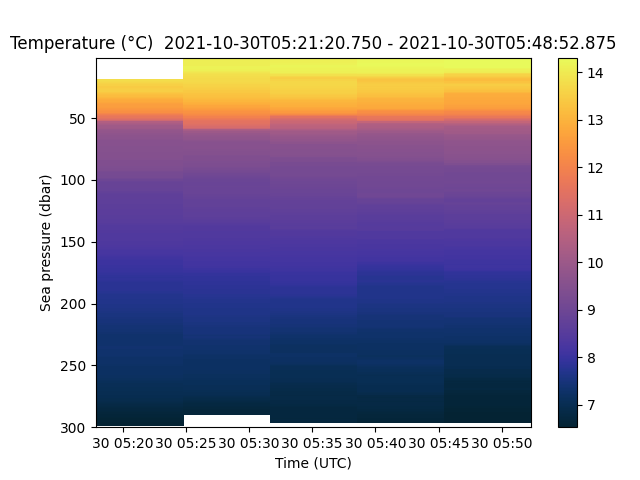
The cmocean toolbox (link) provides colormaps like the one used in the plot above. This one is designed to plot cholorophyll.
Users can customise the length of the time gaps over which the data are interpolated with the threshold input parameter. This method calls
RSK.generate2D()to generate data for visualisation unless the user provides one via theimageargument. AnImageinstance contains x, y and data fields for users’ convenience to render the plot as they like.Below are two examples of how to use the showgap parameter.
To plot the data with the gaps intact:
>>> fig, axes= rsk.images(channels="temperature", direction="down", showgap=True)
... plt.show()
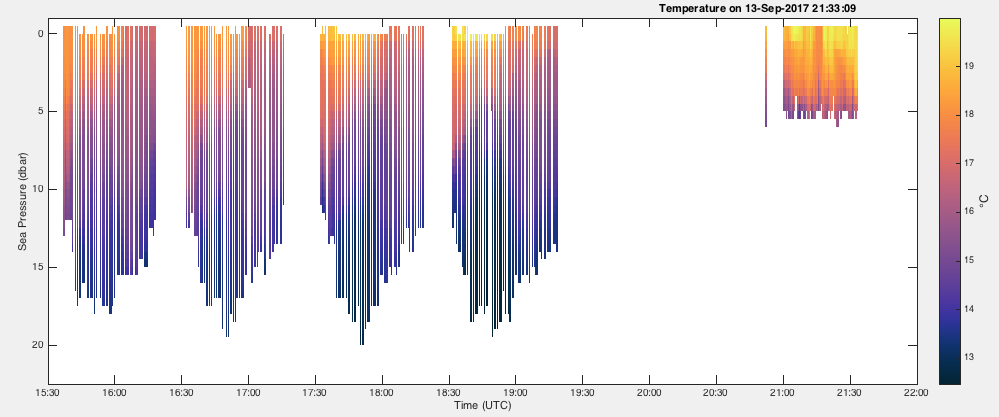
To fill all of the gaps longer than 6 minutes with interpolated values:
>>> fig, axes = rsk.images(channels="temperature", direction="down", showgap=True, threshold=360.0)
... plt.show()
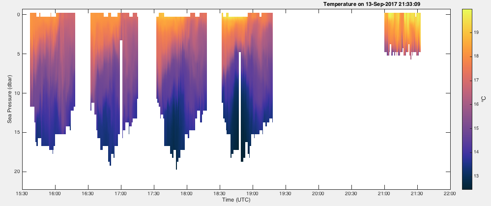
plotTS
- RSK.plotTS(profiles: int | Collection[int] | None = [], direction: str = 'both', isopycnal: int | Collection[int] = 5, schedules: str | Collection[str] = 'all', pressureThreshold: float | None = -1000, showLegend: bool = False) Tuple[plt.Figure, plt.Axes]
Plot a TS diagram in terms of Practical Salinity and Conservative Temperature.
- Parameters:
profiles¶ (Union[int, Collection[int]], optional) – profile number(s). Defaults to [] (all available profiles).
direction¶ (str, optional) – cast direction of either “up”, “down”, or “both”. Defaults to “both”.
isopycnal¶ (Union[int, Collection[int]], optional) – number of isopycnals to show on the plot, or a list containing desired isopycnals. Defaults to 5.
schedules¶ (Union[str, Collection[str]], optional) – schedule label(s) to plot. Can be “all”, a single label string, or a list of label strings. Defaults to “all”, which plots every available schedule.
pressureThreshold¶ (float, optional) – only points with sea pressure greater than this value are plotted; useful for filtering out surface measurements. Defaults to -1000 (no filtering).
showLegend¶ (bool, optional) – toggle the figure legend on and off. Defaults to False.
- Returns:
Tuple[plt.Fig, plt.Axes] – a two-element tuple containing the related figure and axes of the plot.
Plots conservative temperature as a function of Practical Salinity using 0 dbar as a reference. Potential density anomaly contours are drawn automatically.
RSK.plotTS()requiresTEOS-10 GSW toolkit. If the data is stored as a time series, then each point will be coloured according to the time and date it was taken. If the data is organised into profiles, then each profile is plotted with a different colour.NOTE: Absolute Salinity is computed internally because it is required for conservative temperature and potential density. Here it is assumed that the Absolute Salinity (SA) anomaly is zero so that SA = SR (Reference Salinity). This is probably the best approach in many coastal regions where the Absolute Salinity anomaly is not well known (see http://www.teos-10.org/pubs/TEOS-10_Primer.pdf).
Example:
>>> fig, axes = rsk.plotTS(profiles=range(3), direction="down", isopycnal=10)
... plt.show()
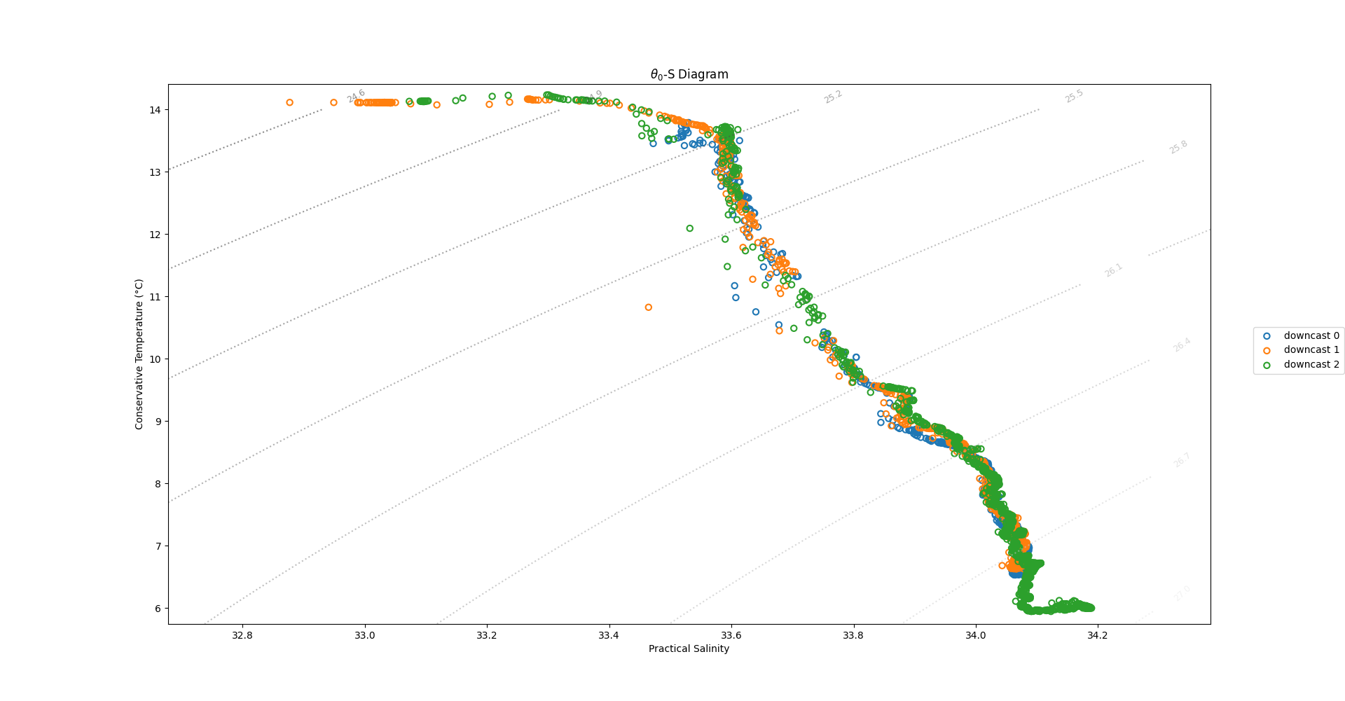
The figure above is T-S diagram plotted using
RSK.plotTS(), where each downcast is plotted with a different colour.RSK.plotTS()outputshandlesto the line objects so that users can customise the curves.
plotprocesseddata
- RSK.plotprocesseddata(channels: str | Collection[str] = []) Tuple[plt.Figure, List[plt.Axes]]
Plot summaries of logger burst data.
- Parameters:
channels¶ (Union[str, Collection[str]], optional) – longName of channel(s) to plot, can be multiple in a cell, if no value is given it will plot all channels. Defaults to [] (all available channels).
- Returns:
Tuple[plt.Figure, List[plt.Axes]] – a two-element tuple containing the related figure and list of axes respectively.
Plots the processedData initially read by
RSK.readprocesseddata().It creates a subplot for every channel available, unless the channel argument is used to select a subset.
The code below provides example usage and a resulting plot.
>>> with RSK("example.rsk") as rsk:
...     t1, t2 = np.datetime64("2020-10-03T11:30:00"), np.datetime64("2020-10-03T19:20:00")
...     rsk.readdata(t1=t1, t2=t2)
...     rsk.readprocesseddata(t1=t1, t2=t2)
...
...     fig, axes = rsk.mergeplots(
...         rsk.plotprocesseddata(channels="pressure"),
...         rsk.plotdata(channels="pressure"),
...     )
...     plt.show()
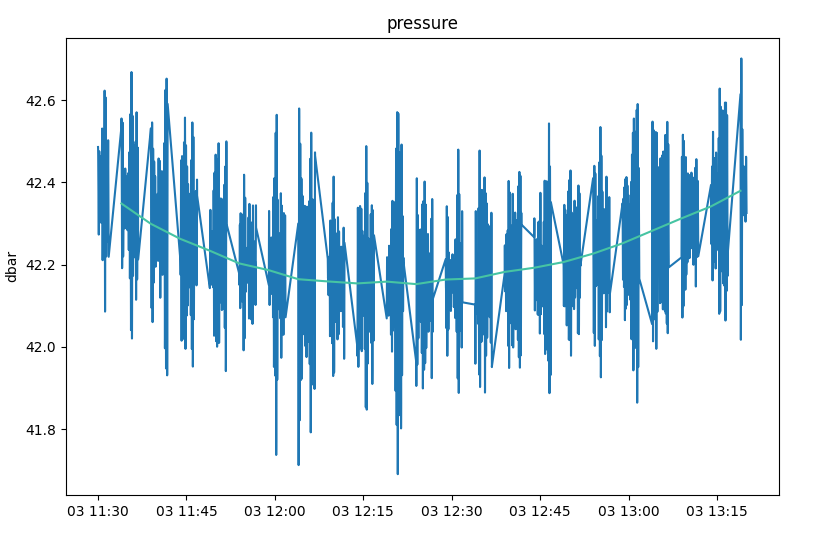
In the figure above, the blue line shows the values in the
RSK.processedDatafield and the purple line shows those from theRSK.datafield.
mergeplots
- static RSK.mergeplots(plottuple1: Tuple[Figure, List[Axes]], plottuple2: Tuple[Figure, List[Axes]]) Tuple[Figure, List[Axes]]
Merge two plots via their associated figure and axes objects.
- Parameters:
- Returns:
Tuple[plt.Figure, List[plt.Axes]] – an updated figure and axes list relating to the merged plot